Tuesday, October 4, 2011

Blog 17 Photo-Realistic Painting Style-Bryce Canyon

Some photos cry out to be seen.  But there seems to always be something you can do with the photo to make it an outstanding painting.  I have begun to paint my Utah collection and THIS image spoke to me.

The long line is rising...drawing your eye into  the picture.  The shorter line points out late afternoon light which creates nice contrast and long shadows.  Can this picture be kicked up a notch?  I think so.

 
My first act was -create a color scheme.
Go to  http://www.colorschemedesigner.com/  to find strongly compatible colors. In Photoshop, I choose a dominate color in the picture with the eyedropper and enter the color picker. Copy the hexadecimal number (Ex: da8860) and enter Color Scheme Designer...paste in the box "Enter the RGB Value".  Revealed is the complement, triad, tetrad of that original (in this case reddy orange color).  For landscapes with skies, photorealistic paintings always need 3 basic color hues.
I have long been a lover of skies and have collected many MANY over the years.  I selected this one for Bryce Canyon.
All I needed to do was greatly expand it, change its colors to match my color scheme and flip it over horizontally so the light came in from the right direction. 
There is no yellow green in the color scheme, so I coaxed the greens into more bluegreen and put dark tones of blue into the shadows. As always I eliminated detail from the photo using the plugin Topaz Labs\Topaz Simplify 3 from http://www.topazlabs.com/

Time to enter Painter.  1. Painting Rock: Don't use clone color; vertically scrub each rock with Acrylic\Opaque Brush Detail 5 4 33 55 0 2 Color Variability=1 4 4  Pick up a different rock color for each rock.
2. Then use clone color with Brushes\SableChiselTipWater 4 36 0 28 0 to smooth the texture.
Using
 these brushes, I consolidated the colors in the rock. 
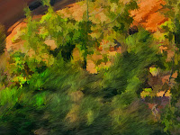
Needle Trees are a bit more tricky!
Sometimes the leaves are in the right spot. BUT if not, here's how to add needles.
1. First blow leaves on with Karen Sperling\SperlingFoliage1 14 70 10 39 .88; save this & clone again to add needles (you’ve got to MAKE leaves in the right spot before you turn them into needles)
2. Then use TreesnBranches\highlightBranches 14 100 37 84 0 Angle=Squeeze 34 Angle 290 Expression Source   and scribble the leaves to make needles.
The bottom is done, the top green leaves are yet to become needles!

MY TRICK:  Both rocks and trees are done with TWO brushes.  The first lays the foundation, the second polishes the product.
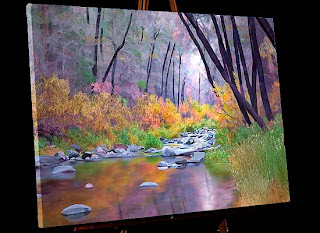
Here's a view of the finished product.

Many of the pictures in this gallery... Computer Art-Woodland Photos
uses the same trick.  Do something, THEN undo it selectively. 

Friday, September 9, 2011

Blog 16 Does a Landscape Painter Paint dogs?

     After a number of years spent trying to master digital painting, brushes, printing on canvas, applying accent colors and brush strokes...I am ready to begin. WHAT!
     They say it takes 10 years to truly get in the groove...to really begin to see in your work and understand others...details that the casual observer would miss.  10 years to notice what you do over and over and begin to call it your "style".  10 years to be able to identify what pictures kept you moving the brush (electronic or wet) long past bedtime.  I have a long way to go.
     I thought I only painted landscapes like this gallery http://www.strengthinperspective.com/Pictures-Oregon/BlueMountains-9/BlueMountains.html  and then...I met Wispy.


I totally love this dog.  No, I don't own him, I just know him.  And to know him is to love him.  He was visiting one day and along came this capture taken by my son Nick.  I thought maybe this image  could tell the world WHY he was so special.


I removed the background and filled with a gradient fill...dark in the area of exaggerated shadow.  As always, I set up the picture as a 16X22 aspect ratio in Photoshop.
I did Wispy fur in Photoshop CS5 using a Mixer Brush...the Round Curve...with Bristles 7% Length 137%  Thickness 40%  Stiffness 50%  Angle 0   Spacing 2%.  It was a joy to sweep  his curly locks in the pattern he was born with!  I smoothed away the hair in his eyes and then made a few prominent locks of my own that crossed his eyes.
     Finally to Corel Painter for Wispy's nose.  I used Image Hose-Gravel!
     So what is my trick??  Realize that absolutely ANY project you do helps you grow...and only through a ton of practice will you get where you want to be!

Tuesday, August 9, 2011

Blog 15 What is a painting? What is art?

By now you know "How to sit in the chair".  That means we have covered tricks to:
      Arrange the furniture
      Wrap your pen hand
      Keep Track of your brushes
      Learn from an Artist Workshop (Karen Sperling)
      Save your brush DETAILS
      Archive intermediate versions of your work
      How large to make your file; use the same file size over and over
      Art programs and plugins that work well together
      How to make a sunburst
      How to paint rockwork (its all about the mortar)
      Be open to the idea of NOT apply paint strokes to a painting...just get the message across.


 So "what IS a painting?" "Have you transformed your photo into a painting?" Here are some things I have "heard" and my take on them:
 1 "Photo Painting produces artworks that are unoriginal and technical".
      (False:  A painting, Photo, or photopainted artwork must never BE unoriginal or mechanical. Try harder!)
 2  "Only a traditional painter can choose which elements to exaggerate...which elements excite".
       (False: The computer blows THAT one out of the water)
 3  "A Painting is pushing imagery around the canvas; a photo is pushing light around and must be done ONLY in the head"
       (False:  These days, both mediums do both)
 4   "Painters AND photographers make bust after bust...and only occassionally a BOOM!
       (Point: Don't be too hard on yourself)
 5  "Painting, making a Photo, or Photo painting  comingles equipment, technical prowess, patience, endurance and the vision of the times." (I say" Here here!!)
Sooooooo  If you love it, just do it!

Tuesday, July 26, 2011

Blog 14 Become a master of the computer's MANY tricks!

The computer  has many MANY tricks to learn, not just those we'd find in art programs. Here is a photo that I felt sent a strong message about Arizona's heritage, the "Wild West".This is the final product portrayed on an easel.
      This painting has one thing deliberately missing.  Paint!
 It begs for sharp edges; it has great texture.  Also, paintings are a bit unbelievable...cleaner and more beautiful than reality could be in a capture. .. and this image is unbelievable enough!  The only paint brush work I did was to eliminate some background clutter, clean the eye sockets,  and relocated some of the elements (Ex: the little blue mask).  I punched the color and used Photoshop's Filter\Artistic\Dry Brush 2  8  2.  That's it.  No more. 
      My Point:  When a photographer goes from "Photo to Canvas", I think the aim is a bit different than a liquid media painter who goes from blank canvas to creation.  In the "Skulls", an incredibly hard outline communicates the harshness of the environment better than a soft brush ever could.
      I want you to FEEL the prickly red cactus.
      It's not what TOOL you use to get your message across, it's that you DO get your message across. 
      I was one to immediately embrace the digital age back in the 80's when many of my photographer friends were using the words "isn't using the computer cheating?"  Nonsense !  Art is about communication and learning the language of the computer is quite like learning how to express yourself with liquid paints.  It's just different.
     Here is a gallery I made in the late 80's.  It was one of the first I put on the web in 1997.  It was made long before I could admit that images like this were painterly...  so I called it "two view". (Far away it looked like a photo; up close it looked like a painting)
 http://www.strengthinperspective.com/Pictures-ComputerArt/WoodlandPhotos-7/WoodlandPhotos.html

Friday, July 15, 2011

Blog 13 Painting rocks of Arizona's Tuzigoot NM

 Every gallery I make ( 16 large wall prints for business walls) tries to include the essence of the space...a smattering of everything found in the region.  "Painting Arizona" would not be complete without paying respect to Indian heritage.   Tuzigoot National Monument, a well preserved 3000 year old Pueblo, presented a difficult task...making rocks come alive!


The distant brown Verde river should be honored too, for without it, no culture could survive.
    The colors have been reduced in number and saturated to start me thinking about the possibilities.   I painted the background trees rather quickly.  The rocks took a looooooong time.
Here's a closeup of the original rockwork.

As you see, the colors have been saturated and reduced in number.  But what would make them really stand out??? 
I decided the MORTAR was the key.  With a Blenders\Pointed Stump brush in Corel Painter 11, I made even FEWER colors in the rocks...and mimiced what it might look like to swish them with a brush. But even more energy went into the "negative space"...the mortar.
I exaggerated the size of the Verde River and the closeness of the autumn trees.   After painting that many rocks, I not only SAW Tuzigoot...I FELT LIKE the persons who placed each boulder into that wall! A big shout out to  http://www.nazstuff.com who is now following my social media attempts. 
Here is my gallery of New Mexico...
http://www.strengthinperspective.com/Pictures-USA/NewMexico-51/NewMexico.html and soon I will post my Arizona work.

Thursday, June 16, 2011

Blog 12 Saguaro Cactus Sunset Painting-Sunburst

      While traveling through Tucson Arizona to collect photos for my current project "Arizona Paintings",  Paul captured this silhouette with the sun illuminating the Santa Rosa Mountains and bursting through a Saguaro Cactus.

     Here is part of the Brush Guide I created after experimenting with Painter Brushes and other techniques to get the look I wanted.
     Notice the words "Sunburst Willmore #159 using Distort\wave and Distort Polar Coordinates".  That references the 159th entry into my database on how to do weird little things in Photoshop...in this case, make a sunburst.  If you would like to know how to do this, email me and I will send you my recipe.

     Here is the finished painting...not a complete silhouette...emphasis on the mountains and addition of the sunburst.


     What I like about painting is that you can place emphasis on what you want to remember...and I will not forget that Arizona sun!

Friday, June 10, 2011

Blog11 Part two: More Programs I use when painting  photos

 NUMBER FOUR  I totally love Corel Painter!  I use Painter11 now but understand that Corel Painter12  is now available.  After considerable trial and error, I decide on brushes and make my Brush Guide shown here. (See Blog 8 for info on Brush Guides.


Painting goes quickly when the image has been made into a believable photo to begin with.
As you can see by looking at the Brush Guide, the same brush is used for the foreground bush and the background tree leaves.  The  brush only  differs by size.

Since the point of my painting is to stuff as much information about Arizona as I can into each picture...I chose to add The Old Man Cactus from the Botannical Garden in Tucson.
Here is the showy Candle Cactus from that garden as well. 
NUMBER FIVE  I finally return to Adobe for a plug in from Nik Software, Viveza!
I concentrate on getting the shadows the right intensity.  Between Viveza, Photoshop and my husband, Paul...the picture takes on dimension.
 

Monday, May 30, 2011

Blog10 Part 1: Art Programs to use when painting  photos

 NUMBER ONE  The first program I use to create my paintings is Photoshop. (CS5 at the moment).  All content changes are made there.  All telephone poles go...all flowers multiply...all skies become interesting.  I try to make a good photograph.
NUMBER TWO  To start to eliminate detail from a photo so it will make a good painting, I use the plugin Topaz Labs\Topaz Simplify 3 from http://www.topazlabs.com/

Here is the Original Photo... Below is the version AFTER Photoshop removed the basketball hoop AND the Topaz plugin eliminated some details.
NUMBER THREE   I then reach out to the internet for a great tool for harmonizing colors. http://www.colorschemedesigner.com/  Here's how I use it:
     In Photoshop, choose a dominate color in the picture with the eyedropper and enter the color picker. Copy the hexadecimal number (Ex: da8860) and enter Color Scheme Designer...paste in the box "Enter the RGB Value".  Suddenly you are privy to LOTS of information and it's all free!  This program gives you a complement, triad, tetrad etc.  I usually choose triad.  I do Printscreen and save the file in photoshop as  colors.psd. This is a great GUIDE to the color palette for this picture...nothing exact...just a quide.  It does tell me only my blue needs a color shift.
In Corel Painter I will make a palette from this colorset for my image.

Friday, May 20, 2011

Blog 9 What size to make a painting...what dpi

      I always make every image a 16X22 which can be printed 22X30 or 30X40.  The edges of paintings often contain vital information which you DON'T want to lose by changing the aspect ratio.  You can often crop and squeeze a photo without damaging the intent.  A Painting?  Not so much.
     Also it pays to work in the same aspect ratio.  As you grow in painting skills, your work begins to come alive.  Sometimes you want to rip off the earlier canvas and replace it with your new masterpiece.  If all paintings are the same aspect ratio (in my case 16X22)...this will be an easy task.
     I generally make my paintings 180DPI at 16X22.  I have worked as low as 100 dpi and as high as 240dpi.  The reasons for this are:
     1. Canvas is not much improved by higher dpi AND paintings  (at least mine) go to canvas.
     2. Higher dpi slows the computer down too much.  Save the details for photos.  A photo can lose 50% details and still provide ample information for a interesting painting.
     Here is a gallery with both painting and photo to provide a taste of Montana scenery.  
http://www.strengthinperspective.com/Pictures-USA/Montana-62/Montana.html    You can see that detailed images are best in straight photographic format.

Friday, May 13, 2011

Blog 8 Save IMPORTANT files...not just the painting

As you can see,  I like to start telling the story of painting with some global issues.  It will be a while before the first stroke is made.  Digital Painting is no different than "wet painting" in that you have to gather supplies, lighting, brushes, cleaning techniques... neither is a sport that can be done without preparation.
     One of the most important things is to decide WHAT files to save and WHERE to save them.
     About WHERE...always save your files in Two places.  Believe me "XZ!!X" happens and you will be glad your paintings are still  able to be found.  I back up my computer once a week with Acronis.  It takes a LONG time because it writes the entire drive structure.  "I do's it the way I see's it!"  could be their motto.
  http://www.acronis.com/

About WHAT...Here are the saved files for a picture in this gallery... http://www.strengthinperspective.com/Pictures-Oregon/ArchedBridges-63/ArchedBridges.html    
  
 Always save the brush guide.  

Always save the original in the exact shape and size of your painting. Why?
2 reasons: Backflowing 10% of the original sometimes enhances the painting AND
Sometimes a client loves the painting BUT wants the true photographic look.


Texture can be tricky so save the NONtextured Version too. (in case you need to redo)  Here's the final image and the texture used applied.


Yes, that's a total of 4!  A brush guide, an original and two versions of the painting. Tell me what you think of my choice of "IMPORTANT"  files? 


Friday, May 6, 2011

Blog 7 Save your brush details...a weird way...but it works!

 Let me repeat "I experiment with brushes until I settle on one best for the area. I then record the settings for that brush INCLUDING all the numbers in the property bar.  It just isn't good enough to only remember which brush is used...size matters!!"
     I paint photorealism with a twist.  For those of us who are computer photo painters (instead of primarily wet paint artists) the digital brushes you use are your life blood.  Here is an early Brush Guide...when I first started making guides.
Notice... at the time... I didn't write the entire property bar code on the brush guide.  Although the name of the brush was helpful, I soon took the process 1 step farther.  "BUT BUT  you say...can't you save a variant of the brush you used? Why bother with an entire brush guide for each picture??"   Here's why:
    1. Brush size matters.  A small brush has an entirely different effect on a painting than the same brush at a larger size.  Brush guides remember for you.
    2.  A brush may be great for a sky on this picture but painting a Seal belly may be your next picture.  You want to remember not just the brush but where you used it.  Soon you have 16 Grass brushes...some for the hillside...others for a watery area...others for a lawn.  Brush guides remember for you.
    3. Once you've committed your painting to canvas and LOOKED at it...you may see you've missed spots or want to clone an ugly part of the picture away by using a different part of the picture.  But  touchups need the same brush to blend the old and new together. Brush guides remember for you.
    4. Finally, some photo painters, I'm told,  put TIME gaps between one painting and the next.  A brush guide for your last picture will help you start your next picture a month later.
Brush guides remember for you.
     Here's a link to the finished Arched Bridge image among others in that gallery:  http://www.strengthinperspective.com/Pictures-Oregon/ArchedBridges-63/ArchedBridges.html


Please let me know if anyone else makes a brush guide like this.  I'd love to look them up!

Friday, April 22, 2011

Blog 6 Painting Flamingos

      Here is a finished product using the brush I described in earlier blogs.  The American Flamingo in the foreground...Chilean Flamingos in the background.
You  can see the brush work in this closeup. 
 I painted the set of flamingos, seen here at http://www.strengthinperspective.com/Pictures-DigitalCollections/FlamingoPaintings-61/FlamingoPaintings.html  when I knew VERY little about brushes.

I was familiar with photoshop...CS5...so I cracked open Painter X and familiarized myself with some of the new jargon...then I went to California to a retreat led by Karen Sperling.  She is a hard working artist with a knack for explaining things in language you really understand.  It is a gift you give yourself to study under a talented computer artist.  Thanks Karen.
 http://karensperling.com    http://artistrymag.com

Wednesday, April 13, 2011

Blog 5 Keeping Track of Brushes

There are many ways that people commonly keep track of their brushes.  I'm sure you have done Window\Custom Palette\Organizer and exported the brush file you commonly use OR maybe export a brush file for every image done, as I do, because all images are DIFFERENT and require a different set of brushes!  But did that satisfy me?  Oh, no, I had to take it one step further (the Virgo in me) and that is the subject of this picture.
This image, first seen in "Blog 2-How to Sit in the Chair"... is a blow up to better show monitor #3.  Way to the left...but never left out...I use this computer while painting to show the brushes.  Here's the deal.
     I experiment with brushes until I settle on one best for the area...in this example the feathers of the flamingo head.  I then record the stats of that brush INCLUDING all the numbers in the property bar.  It just isn't good enough to only remember which brush is used...size matters...as does opacity, resat, bleed and jitter.  When starting a new project I can say to myself   "didn't I have a great brush for this job while working on flamingos".  Of all the things I've tried in the past...a pile of "brush detail files" has been VERY useful.

Friday, April 8, 2011

Blog 4 Painting can be devastating

     I just lost my entire day's work for yesterday.  I used ctrl F in Windows Explorer and sought files with the same name...nothing.  I looked through Adobe CS5 Bridge in every drawer I visited yesterday...nothing.  I am working on a piece that will be 5 feet wide and 2.5 feet deep.  That means everything I do (with a 3 pixel brush) is done a million times.  And now I have to do it over.  My only solace is that I kept track of the brushes I used...and choosing the brush is half the work!
     I once heard Jeremy Sutton (http://www.jeremysutton.com/) say that he was filled with anxiety until he got his brush chosen.  From then on, painting was fun.  On my next blog I'm going to show you how I keep track of my brushes.  Jeremy, I thank you for your candor.  You got me started on a good technique!

Friday, April 1, 2011

Blog entry #3 My hand wrap

I know you are curious about the hand wrap.  Did I burn my hand on the stove? No...I got some wonderful help from the web that helped solve a problem. When you rest your arm on the wacom tablet (which is warm) you experience stickiness...and if you wear a long sleeve shirt, you get button scrape. By cutting off two fingers of a dust glove and covering loose ends of your glove and your shirt with an ace wrap...you can paint for hours.  Strength in Perspective.

Thursday, March 31, 2011

Entry #2 How to Sit in the Chair (don't laugh)

     It may seem funny, but one of the first things that I had to create was "How to Sit in the Chair".  This picture shows  the product of my trial and error.     The Cintiq 21ux is big and a bit too heavy for one's lap AND it must work in tandem with my other two monitors.  How to sit...how to sit? 
     My answer was to pull my chair under the desk enough to rest one leg of the wacom tablet on the arm.  The other leg is on the desk and the entire experience I call "getting in the cockpit".  I need to get very intimate with photos painted for Strength in Perspective
 

Tuesday, March 29, 2011

Entry #1

Paul and I have been photographing places & applying digital nuances to images since 1994!  We have embraced the computer revolution at every turn.   Our website, Strength in Perspective, has enabled me to organize our images into galleries from which clients (restaurants, medical clinics, and working environments of all types) select wall art they rent or buy.

A few years ago I plunged head long into computer photo painting with a pen and wacom tablet, using Photoshop and Corel Painter.  I decided to create a blog to share some of the tricks I've learned throughout my struggle to make canvas paintings from photos we take.

I'd love to hear from you about the passion we share...the computer, the image, and the feeling of mastery.