Tuesday, July 26, 2011

Blog 14 Become a master of the computer's MANY tricks!

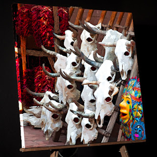
The computer  has many MANY tricks to learn, not just those we'd find in art programs. Here is a photo that I felt sent a strong message about Arizona's heritage, the "Wild West".This is the final product portrayed on an easel.
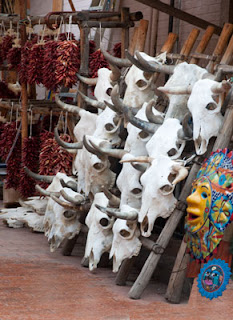
      This painting has one thing deliberately missing.  Paint!
 It begs for sharp edges; it has great texture.  Also, paintings are a bit unbelievable...cleaner and more beautiful than reality could be in a capture. .. and this image is unbelievable enough!  The only paint brush work I did was to eliminate some background clutter, clean the eye sockets,  and relocated some of the elements (Ex: the little blue mask).  I punched the color and used Photoshop's Filter\Artistic\Dry Brush 2  8  2.  That's it.  No more. 
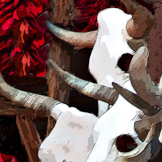
      My Point:  When a photographer goes from "Photo to Canvas", I think the aim is a bit different than a liquid media painter who goes from blank canvas to creation.  In the "Skulls", an incredibly hard outline communicates the harshness of the environment better than a soft brush ever could.
      I want you to FEEL the prickly red cactus.
      It's not what TOOL you use to get your message across, it's that you DO get your message across. 
      I was one to immediately embrace the digital age back in the 80's when many of my photographer friends were using the words "isn't using the computer cheating?"  Nonsense !  Art is about communication and learning the language of the computer is quite like learning how to express yourself with liquid paints.  It's just different.
     Here is a gallery I made in the late 80's.  It was one of the first I put on the web in 1997.  It was made long before I could admit that images like this were painterly...  so I called it "two view". (Far away it looked like a photo; up close it looked like a painting)
 http://www.strengthinperspective.com/Pictures-ComputerArt/WoodlandPhotos-7/WoodlandPhotos.html

Friday, July 15, 2011

Blog 13 Painting rocks of Arizona's Tuzigoot NM

 Every gallery I make ( 16 large wall prints for business walls) tries to include the essence of the space...a smattering of everything found in the region.  "Painting Arizona" would not be complete without paying respect to Indian heritage.   Tuzigoot National Monument, a well preserved 3000 year old Pueblo, presented a difficult task...making rocks come alive!


The distant brown Verde river should be honored too, for without it, no culture could survive.
    The colors have been reduced in number and saturated to start me thinking about the possibilities.   I painted the background trees rather quickly.  The rocks took a looooooong time.
Here's a closeup of the original rockwork.

As you see, the colors have been saturated and reduced in number.  But what would make them really stand out??? 
I decided the MORTAR was the key.  With a Blenders\Pointed Stump brush in Corel Painter 11, I made even FEWER colors in the rocks...and mimiced what it might look like to swish them with a brush. But even more energy went into the "negative space"...the mortar.
I exaggerated the size of the Verde River and the closeness of the autumn trees.   After painting that many rocks, I not only SAW Tuzigoot...I FELT LIKE the persons who placed each boulder into that wall! A big shout out to  http://www.nazstuff.com who is now following my social media attempts. 
Here is my gallery of New Mexico...
http://www.strengthinperspective.com/Pictures-USA/NewMexico-51/NewMexico.html and soon I will post my Arizona work.

Thursday, June 16, 2011

Blog 12 Saguaro Cactus Sunset Painting-Sunburst

      While traveling through Tucson Arizona to collect photos for my current project "Arizona Paintings",  Paul captured this silhouette with the sun illuminating the Santa Rosa Mountains and bursting through a Saguaro Cactus.

     Here is part of the Brush Guide I created after experimenting with Painter Brushes and other techniques to get the look I wanted.
     Notice the words "Sunburst Willmore #159 using Distort\wave and Distort Polar Coordinates".  That references the 159th entry into my database on how to do weird little things in Photoshop...in this case, make a sunburst.  If you would like to know how to do this, email me and I will send you my recipe.

     Here is the finished painting...not a complete silhouette...emphasis on the mountains and addition of the sunburst.


     What I like about painting is that you can place emphasis on what you want to remember...and I will not forget that Arizona sun!

Friday, June 10, 2011

Blog11 Part two: More Programs I use when painting  photos

 NUMBER FOUR  I totally love Corel Painter!  I use Painter11 now but understand that Corel Painter12  is now available.  After considerable trial and error, I decide on brushes and make my Brush Guide shown here. (See Blog 8 for info on Brush Guides.


Painting goes quickly when the image has been made into a believable photo to begin with.
As you can see by looking at the Brush Guide, the same brush is used for the foreground bush and the background tree leaves.  The  brush only  differs by size.

Since the point of my painting is to stuff as much information about Arizona as I can into each picture...I chose to add The Old Man Cactus from the Botannical Garden in Tucson.
Here is the showy Candle Cactus from that garden as well. 
NUMBER FIVE  I finally return to Adobe for a plug in from Nik Software, Viveza!
I concentrate on getting the shadows the right intensity.  Between Viveza, Photoshop and my husband, Paul...the picture takes on dimension.
 

Monday, May 30, 2011

Blog10 Part 1: Art Programs to use when painting  photos

 NUMBER ONE  The first program I use to create my paintings is Photoshop. (CS5 at the moment).  All content changes are made there.  All telephone poles go...all flowers multiply...all skies become interesting.  I try to make a good photograph.
NUMBER TWO  To start to eliminate detail from a photo so it will make a good painting, I use the plugin Topaz Labs\Topaz Simplify 3 from http://www.topazlabs.com/

Here is the Original Photo... Below is the version AFTER Photoshop removed the basketball hoop AND the Topaz plugin eliminated some details.
NUMBER THREE   I then reach out to the internet for a great tool for harmonizing colors. http://www.colorschemedesigner.com/  Here's how I use it:
     In Photoshop, choose a dominate color in the picture with the eyedropper and enter the color picker. Copy the hexadecimal number (Ex: da8860) and enter Color Scheme Designer...paste in the box "Enter the RGB Value".  Suddenly you are privy to LOTS of information and it's all free!  This program gives you a complement, triad, tetrad etc.  I usually choose triad.  I do Printscreen and save the file in photoshop as  colors.psd. This is a great GUIDE to the color palette for this picture...nothing exact...just a quide.  It does tell me only my blue needs a color shift.
In Corel Painter I will make a palette from this colorset for my image.

Friday, May 20, 2011

Blog 9 What size to make a painting...what dpi

      I always make every image a 16X22 which can be printed 22X30 or 30X40.  The edges of paintings often contain vital information which you DON'T want to lose by changing the aspect ratio.  You can often crop and squeeze a photo without damaging the intent.  A Painting?  Not so much.
     Also it pays to work in the same aspect ratio.  As you grow in painting skills, your work begins to come alive.  Sometimes you want to rip off the earlier canvas and replace it with your new masterpiece.  If all paintings are the same aspect ratio (in my case 16X22)...this will be an easy task.
     I generally make my paintings 180DPI at 16X22.  I have worked as low as 100 dpi and as high as 240dpi.  The reasons for this are:
     1. Canvas is not much improved by higher dpi AND paintings  (at least mine) go to canvas.
     2. Higher dpi slows the computer down too much.  Save the details for photos.  A photo can lose 50% details and still provide ample information for a interesting painting.
     Here is a gallery with both painting and photo to provide a taste of Montana scenery.  
http://www.strengthinperspective.com/Pictures-USA/Montana-62/Montana.html    You can see that detailed images are best in straight photographic format.

Friday, May 13, 2011

Blog 8 Save IMPORTANT files...not just the painting

As you can see,  I like to start telling the story of painting with some global issues.  It will be a while before the first stroke is made.  Digital Painting is no different than "wet painting" in that you have to gather supplies, lighting, brushes, cleaning techniques... neither is a sport that can be done without preparation.
     One of the most important things is to decide WHAT files to save and WHERE to save them.
     About WHERE...always save your files in Two places.  Believe me "XZ!!X" happens and you will be glad your paintings are still  able to be found.  I back up my computer once a week with Acronis.  It takes a LONG time because it writes the entire drive structure.  "I do's it the way I see's it!"  could be their motto.
  http://www.acronis.com/

About WHAT...Here are the saved files for a picture in this gallery... http://www.strengthinperspective.com/Pictures-Oregon/ArchedBridges-63/ArchedBridges.html    
  
 Always save the brush guide.  

Always save the original in the exact shape and size of your painting. Why?
2 reasons: Backflowing 10% of the original sometimes enhances the painting AND
Sometimes a client loves the painting BUT wants the true photographic look.


Texture can be tricky so save the NONtextured Version too. (in case you need to redo)  Here's the final image and the texture used applied.


Yes, that's a total of 4!  A brush guide, an original and two versions of the painting. Tell me what you think of my choice of "IMPORTANT"  files?