Sunday, April 21, 2013

Blog 20 "The Stages between a Photo and a Painting"

Ansel Adams was the well known photographer who developed the "Zone System".  By identifying the lightness of an image and correlating it with processing film time, you could  bring out every squeak of detail in shadow and highlight.  A discreet connection between exposure of the film and the time spent in the developer bath is called a zone.  Ansel Adam's Zone System was solving a problem of his day.

I think digital imagery and painting have a problem to solve too.  One  can spot a photo  (although that's getting harder and harder) and distinguish it from a painting BUT what about the stages in between.  The dilemma is particularly troubling when you use a tool like a computer.  There are many MANY plugins (or programs that render a particular style onto the image) for Photoshop and Corel Painter alike.  Do you  reach the end product "painting" even though you use a computerized technique somewhere along the way?  If you mix and match one computerized technique with another and another...is the result a doctored image or has it risen to the goal of being a "painting". 

I think there are "zones" between a photo and its photo-painting.  Consider a bird flying across the ocean.  He flies a while and then drops down to a "Landing"...an island or rock ...which makes sense for him to pause or to eat.  If there are "landings between one continent and another, the bird can fly and stop, fly and stop..."  So too are there Landings which make sense between a photo and a painting...imagery which is neither BUT looks good, conveys your intent and is by any measure darn good art! 

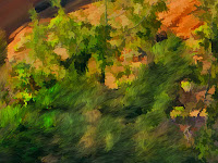
Let's give the "landings" a discrete number, say 1-7.  A "2" would be an image that is quite photographic and a "6" would be quite novel and painterly etc. TIP:  I like to look at my painting CANDIDATES and say "I can try to make a "4" out of this", or "This would be a great 7."

Here are some of my original captures and what I THINK  the resultant picture's "landing" became...ie just how painterly was the file I sent to the printer?


Think in advance about how much deviation you intend to impart...how much change the image ALLOWS you to impart.  There is no wrong answer.
So my TIP is, can you put a number on it?


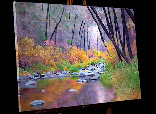
Here is a gallery I completed in 2010.  Can you see how every picture has a different landing...(or pitch...or degree of deviation from a photo). California's Northern Coast from Strength in Perspective.

Our most recent release is "Oregon Autumn Scenery".  You'll recognize many of the above pictures there.

Friday, November 16, 2012

Blog 19 How I Made Painterly Sketches of Oregon Covered Bridges

Of the 300 covered bridges that were used in 1930,  more than 50 still remain.  They are visited by people with cameras from many many countries in the world.  Most Phototrips we have taken over the years have included at least one of Oregon's Covered Bridges.   Finally it was time to compile ALL the film into a gallery honoring the unique form and function of the covered bridge. 
But what a daunting task!! 

1. STYLE: There were more than 50  images to work on.  It usually takes about a week for a painting.  I needed a technique that would create a pleasing look but speed along!!     (I needed a Sketch Program or Plugin.)
2. TONE: Almost all covered bridges are white so I needed  to have a basic white color they could all share.  Photos were taken over the years and in different daytimes and seasons.  When a  color like white is not the same tone in all gallery images meant to be hung near each other, some bridge will look sick in comparison to another.  No. All bridges had to be honored equally.  The surroundings could vary...should vary...but the bridges should not have a color cast. Visit our 
Oregon Covered Bridges to get a handle on the style of this collection. 
 
Off to Photoshop. My first process was to make a good 16X22 @180dpi photo from the original.  I soon learned to forget the sign at this stage...it would have to be created at the end of the process.


It would be necessary to:
1. Select the bridge in every image, put it on a separate layer and do image\adjustments\Black & White.
2. Flatten the image
3. Do image\adjustments\shadows-highlights
to eliminate any pure white. (saving detail)
4. Lighten the bridge interior so you could see the boards
5. Trash any mask in Channels.  (The Sketch program does NOT like masks!)
I think a great sketch treatment of a photo is to use the "Akvis Sketch" program found at  Akvis.com  It is well worth the money.  I tried many techniques with programs I already had, but none give the quick, clean, treatment that Akvis does.  My thought was- leave the structural detail of the bridge intact but make the surroundings surreal yet identifiable.  I would add my own color touches later. A closeup shows the strokes in clearer detail.
Using Style Classic, the settings I used were:
AKVIS B&W Sketch Light
Charcoal 3
Coloration 84
Color Pencil 27
Stroke Thickness 7
Stroke Length 88
Midtones Intensity 8
Midtones Hatching 42

As you see, many options...much trial and error...and then save the preset so you can use it again and again.  About 5 different presets were necessary for 53 bridges.

Not done yet! To get an image which is sharp enough and has enough color to be painterly, you return to photoshop. (And create a bridge sign that is readable)
  One down, 52 more to go.
From this original...

Using these strokes...

Comes this end product.

  My Tip: There are many ways to get the computer to help with your daily work!!!


Thursday, June 7, 2012

Blog 18 Painting Utah's Photographic Landscapes

I make galleries of ~16 large landscape art in each.  All 16 pictures are of the same concept or location.  They make up a group of pictures that we take to a business where we switch last time's gallery with the new one.  They have to be similar in tone and style to make walking through the business a pleasing experience for employee or visitor alike.  When I make a gallery, I generally fall into a passion for it and it alone for about 6 months.  I do nothing else on the computer until the images are made.   Sure enough, it's been about 6 months since my last blog entry.

Here is the photo that I transformed into the digital painting on the right ; I found interesting these unique rocks (like stacked pancakes) at Zion National Park.

 1. My first act with EVERY picture is  to create a color scheme.  You'll recall from Blog 9... I use  http://www.colorschemedesigner.com/
to find 
strongly compatible colors.


In Photoshop, I choose a dominate color in the picture with the eyedropper and enter the color picker. Copy the hexadecimal number (Ex: b27b71) and enter Color Scheme Designer...paste in the box "Enter the RGB Value".  I usually use the triad of the original color...print screen and copy the clipboard to a file which you see here.  The blobs of color are my additional choices from the picture; these 21 colors will be the basis of my colorset.

2. My workflow's next step: eliminating detail from a photo by using the Photoshop plugin from Topaz Labs...Topaz Simplify 3 from http://www.topazlabs.com.  I spend more time setting up the photo in Photoshop than I do painting it once I set it up.  I want the light to come in from the right angle...the contrast to show what the subject is...the picture to have a certain "feel" .

3. In Painter 12   I experiment until I decide on brushes that will transform the picture.   Notice the detail I keep on each image!!!  I always keep track of what brush was used for a feature.  A quick review of Blog 8 will remind you  WHY!!!  I want to be able to recreate the exact brush even if I crash my machine...lose all my brushes...or am gone for a huge computer painting absence. (which obliterates my memory completely)

4. This picture shows the effect of using the Acrylic\Opaque Brush to scrub the detail out of the rock with a sweeping motion.  Each rock was painted with a chosen color, not a clone color.


Compare the original Zion with an area showing scrubbed rock. There is certainly no "photo" left when this treatment is complete.

 MY TRICKS:

  • Spend a lot of time setting up the picture and THEN paint it.
  • Scrub the detail out of a rock to give a painterly effect.
  • Always keep complete info on the brushes used to create the image.

Take a look at the images in "Painting Utah's Photographic Landscapes".   All 16 of the images followed the same workflow as Zion.      See you in 6 months.

Tuesday, October 4, 2011

Blog 17 Photo-Realistic Painting Style-Bryce Canyon

Some photos cry out to be seen.  But there seems to always be something you can do with the photo to make it an outstanding painting.  I have begun to paint my Utah collection and THIS image spoke to me.

The long line is rising...drawing your eye into  the picture.  The shorter line points out late afternoon light which creates nice contrast and long shadows.  Can this picture be kicked up a notch?  I think so.

 
My first act was -create a color scheme.
Go to  http://www.colorschemedesigner.com/  to find strongly compatible colors. In Photoshop, I choose a dominate color in the picture with the eyedropper and enter the color picker. Copy the hexadecimal number (Ex: da8860) and enter Color Scheme Designer...paste in the box "Enter the RGB Value".  Revealed is the complement, triad, tetrad of that original (in this case reddy orange color).  For landscapes with skies, photorealistic paintings always need 3 basic color hues.
I have long been a lover of skies and have collected many MANY over the years.  I selected this one for Bryce Canyon.
All I needed to do was greatly expand it, change its colors to match my color scheme and flip it over horizontally so the light came in from the right direction. 
There is no yellow green in the color scheme, so I coaxed the greens into more bluegreen and put dark tones of blue into the shadows. As always I eliminated detail from the photo using the plugin Topaz Labs\Topaz Simplify 3 from http://www.topazlabs.com/

Time to enter Painter.  1. Painting Rock: Don't use clone color; vertically scrub each rock with Acrylic\Opaque Brush Detail 5 4 33 55 0 2 Color Variability=1 4 4  Pick up a different rock color for each rock.
2. Then use clone color with Brushes\SableChiselTipWater 4 36 0 28 0 to smooth the texture.
Using
 these brushes, I consolidated the colors in the rock. Needle Trees are a bit more tricky!
Sometimes the leaves are in the right spot. BUT if not, here's how to add needles.
1. First blow leaves on with Karen Sperling\SperlingFoliage1 14 70 10 39 .88; save this & clone again to add needles (you’ve got to MAKE leaves in the right spot before you turn them into needles)
2. Then use TreesnBranches\highlightBranches 14 100 37 84 0 Angle=Squeeze 34 Angle 290 Expression Source   and scribble the leaves to make needles.
The bottom is done, the top green leaves are yet to become needles!

MY TRICK:  Both rocks and trees are done with TWO brushes.  The first lays the foundation, the second polishes the product.
Here's a view of the finished product.

Many of the pictures in this gallery... Computer Art-Woodland Photos
uses the same trick.  Do something, THEN undo it selectively. 

Friday, September 9, 2011

Blog 16 Does a Landscape Painter Paint dogs?

     After a number of years spent trying to master digital painting, brushes, printing on canvas, applying accent colors and brush strokes...I am ready to begin. WHAT!
     They say it takes 10 years to truly get in the groove...to really begin to see in your work and understand others...details that the casual observer would miss.  10 years to notice what you do over and over and begin to call it your "style".  10 years to be able to identify what pictures kept you moving the brush (electronic or wet) long past bedtime.  I have a long way to go.
     I thought I only painted landscapes like this gallery http://www.strengthinperspective.com/Pictures-Oregon/BlueMountains-9/BlueMountains.html  and then...I met Wispy.


I totally love this dog.  No, I don't own him, I just know him.  And to know him is to love him.  He was visiting one day and along came this capture taken by my son Nick.  I thought maybe this image  could tell the world WHY he was so special.


I removed the background and filled with a gradient fill...dark in the area of exaggerated shadow.  As always, I set up the picture as a 16X22 aspect ratio in Photoshop.
I did Wispy fur in Photoshop CS5 using a Mixer Brush...the Round Curve...with Bristles 7% Length 137%  Thickness 40%  Stiffness 50%  Angle 0   Spacing 2%.  It was a joy to sweep  his curly locks in the pattern he was born with!  I smoothed away the hair in his eyes and then made a few prominent locks of my own that crossed his eyes.
     Finally to Corel Painter for Wispy's nose.  I used Image Hose-Gravel!
     So what is my trick??  Realize that absolutely ANY project you do helps you grow...and only through a ton of practice will you get where you want to be!

Tuesday, August 9, 2011

Blog 15 What is a painting? What is art?

By now you know "How to sit in the chair".  That means we have covered tricks to:
      Arrange the furniture
      Wrap your pen hand
      Keep Track of your brushes
      Learn from an Artist Workshop (Karen Sperling)
      Save your brush DETAILS
      Archive intermediate versions of your work
      How large to make your file; use the same file size over and over
      Art programs and plugins that work well together
      How to make a sunburst
      How to paint rockwork (its all about the mortar)
      Be open to the idea of NOT apply paint strokes to a painting...just get the message across.


 So "what IS a painting?" "Have you transformed your photo into a painting?" Here are some things I have "heard" and my take on them:
 1 "Photo Painting produces artworks that are unoriginal and technical".
      (False:  A painting, Photo, or photopainted artwork must never BE unoriginal or mechanical. Try harder!)
 2  "Only a traditional painter can choose which elements to exaggerate...which elements excite".
       (False: The computer blows THAT one out of the water)
 3  "A Painting is pushing imagery around the canvas; a photo is pushing light around and must be done ONLY in the head"
       (False:  These days, both mediums do both)
 4   "Painters AND photographers make bust after bust...and only occassionally a BOOM!
       (Point: Don't be too hard on yourself)
 5  "Painting, making a Photo, or Photo painting  comingles equipment, technical prowess, patience, endurance and the vision of the times." (I say" Here here!!)
Sooooooo  If you love it, just do it!

Tuesday, July 26, 2011

Blog 14 Become a master of the computer's MANY tricks!

The computer  has many MANY tricks to learn, not just those we'd find in art programs. Here is a photo that I felt sent a strong message about Arizona's heritage, the "Wild West".This is the final product portrayed on an easel.
      This painting has one thing deliberately missing.  Paint!
 It begs for sharp edges; it has great texture.  Also, paintings are a bit unbelievable...cleaner and more beautiful than reality could be in a capture. .. and this image is unbelievable enough!  The only paint brush work I did was to eliminate some background clutter, clean the eye sockets,  and relocated some of the elements (Ex: the little blue mask).  I punched the color and used Photoshop's Filter\Artistic\Dry Brush 2  8  2.  That's it.  No more. 
      My Point:  When a photographer goes from "Photo to Canvas", I think the aim is a bit different than a liquid media painter who goes from blank canvas to creation.  In the "Skulls", an incredibly hard outline communicates the harshness of the environment better than a soft brush ever could.
      I want you to FEEL the prickly red cactus.
      It's not what TOOL you use to get your message across, it's that you DO get your message across. 
      I was one to immediately embrace the digital age back in the 80's when many of my photographer friends were using the words "isn't using the computer cheating?"  Nonsense !  Art is about communication and learning the language of the computer is quite like learning how to express yourself with liquid paints.  It's just different.
     Here is a gallery I made in the late 80's.  It was one of the first I put on the web in 1997.  It was made long before I could admit that images like this were painterly...  so I called it "two view". (Far away it looked like a photo; up close it looked like a painting)
 http://www.strengthinperspective.com/Pictures-ComputerArt/WoodlandPhotos-7/WoodlandPhotos.html