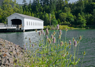
But what a daunting task!!
1. STYLE: There were more than 50 images to work on. It usually takes about a week for a painting. I needed a technique that would create a pleasing look but speed along!! (I needed a Sketch Program or Plugin.)
2. TONE: Almost all covered bridges are white so I needed to have a basic white color they could all share. Photos were taken over the years and in different daytimes and seasons. When a color like white is not the same tone in all gallery images meant to be hung near each other, some bridge will look sick in comparison to another. No. All bridges had to be honored equally. The surroundings could vary...should vary...but the bridges should not have a color cast. Visit our Oregon Covered Bridges to get a handle on the style of this collection.
Off to Photoshop. My first process was to make a good 16X22 @180dpi photo from the original. I soon learned to forget the sign at this stage...it would have to be created at the end of the process.

It would be necessary to:
1. Select the bridge in every image, put it on a separate layer and do image\adjustments\Black & White.
2. Flatten the image
3. Do image\adjustments\shadows-highlights
to eliminate any pure white. (saving detail)
4. Lighten the bridge interior so you could see the boards
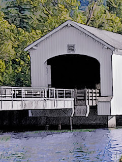
5. Trash any mask in Channels. (The Sketch program does NOT like masks!) I think a great sketch treatment of a photo is to use the "Akvis Sketch" program found at Akvis.com It is well worth the money. I tried many techniques with programs I already had, but none give the quick, clean, treatment that Akvis does. My thought was- leave the structural detail of the bridge intact but make the surroundings surreal yet identifiable. I would add my own color touches later. A closeup shows the strokes in clearer detail.
 Using Style Classic, the settings I used were:
AKVIS B&W Sketch Light
Charcoal 3
Coloration 84
Color Pencil 27
Stroke Thickness 7
Stroke Length 88
Midtones Intensity 8
Midtones Hatching 42
As you see, many options...much trial and error...and then save the preset so you can use it again and again. About 5 different presets were necessary for 53 bridges.
Not done yet! To get an image which is sharp enough and has enough color to be painterly, you return to photoshop. (And create a bridge sign that is readable)
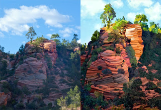
From this original...
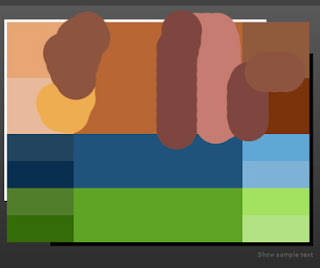
Using these strokes...
Comes this end product.
My Tip: There are many ways to get the computer to help with your daily work!!!


